There is a multitude of interior design elements to consider when you’re redecorating and redesigning your home, but few are as important as your chosen storage ideas. The right storage doesn’t just have the power to upgrade a space with personality and create a long-lasting impression; it can also make a room look more expensive and refined, which is a big win when you’re decorating on a smaller budget.
Here, designers, decorators, and experts reveal how to approach choosing the best storage ideas to restore calm, provide display space and be suitably chic.
What storage makes a house look expensive?
If you want to make a home look expensive, it is important to think cleverly about storage solutions. Where budgets permit, redesigning your room storage ideas is an often-overlooked design intervention. Done well and the result can be a lasting design legacy; one that can make a house look expensive.
1. Go for a larder with living room looks
(Image credit: Lanserring)
Clever and time-efficient kitchen storage decisions are particularly important in this family space. When designing a kitchen, start with an audit of kitchenware.
‘Working out which items you use every day and those that are for special occasions will help determine how much and what type of storage you need,’ says Dave Young, founder, of Husk.
Cull any redundant items if you want to make a kitchen look expensive. If you’re not lacking worktop space, Dave also recommends making room for a row of floor-to-ceiling built-in cupboards. ‘They use the dead space below the ceiling and are large enough to conceal all your gadgets, where they can be plugged in, easy to access and ready to use.
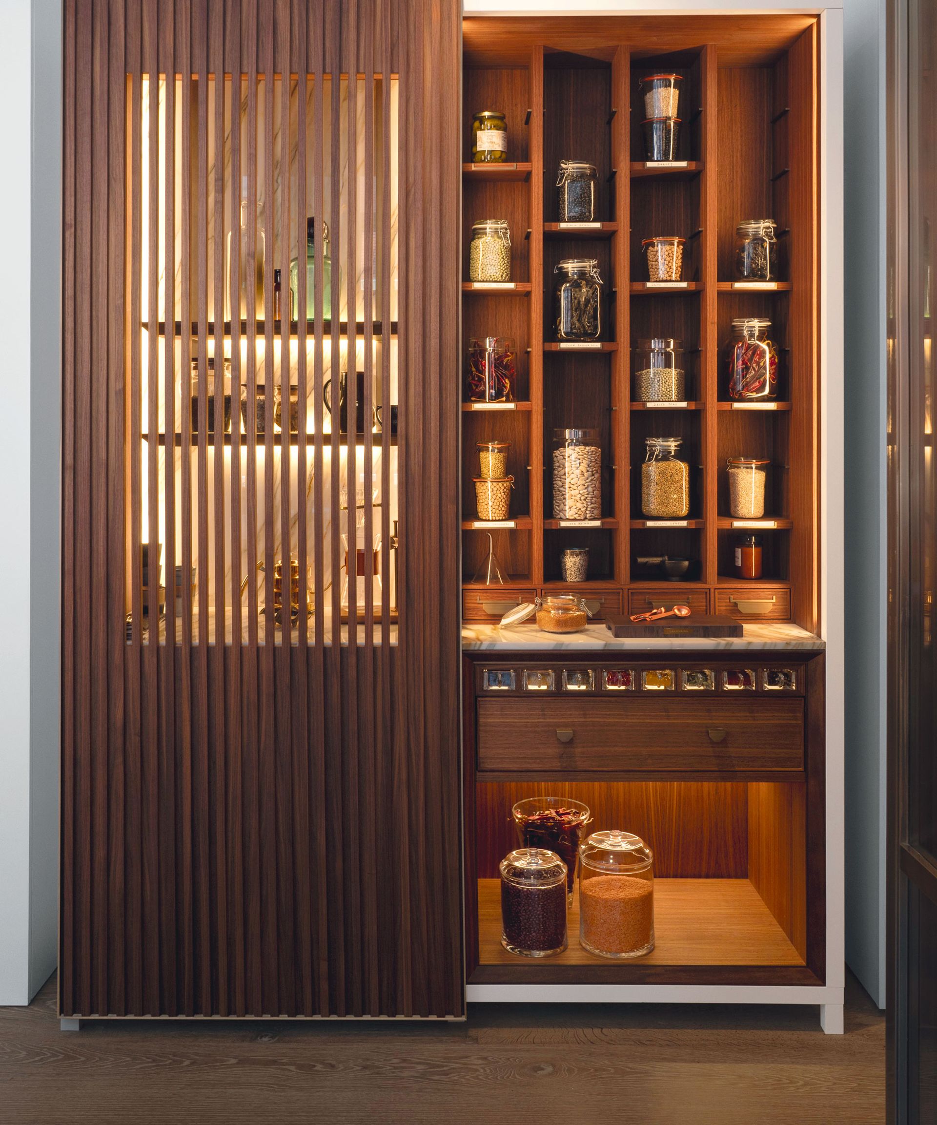
Here, this bespoke Pickling Cabinet by Lanserring (opens in new tab) is an exquisite example of larders that are taking design cues from living room furniture. It is crafted from American walnut, patinated brass and marble, with slatted sliding screens offering glimpses of lighted internal spaces.
2. Curate bespoke display shelfs worthy of showing off
(Image credit: Alice Lane Interiors / Nicole Gerulat Photography)
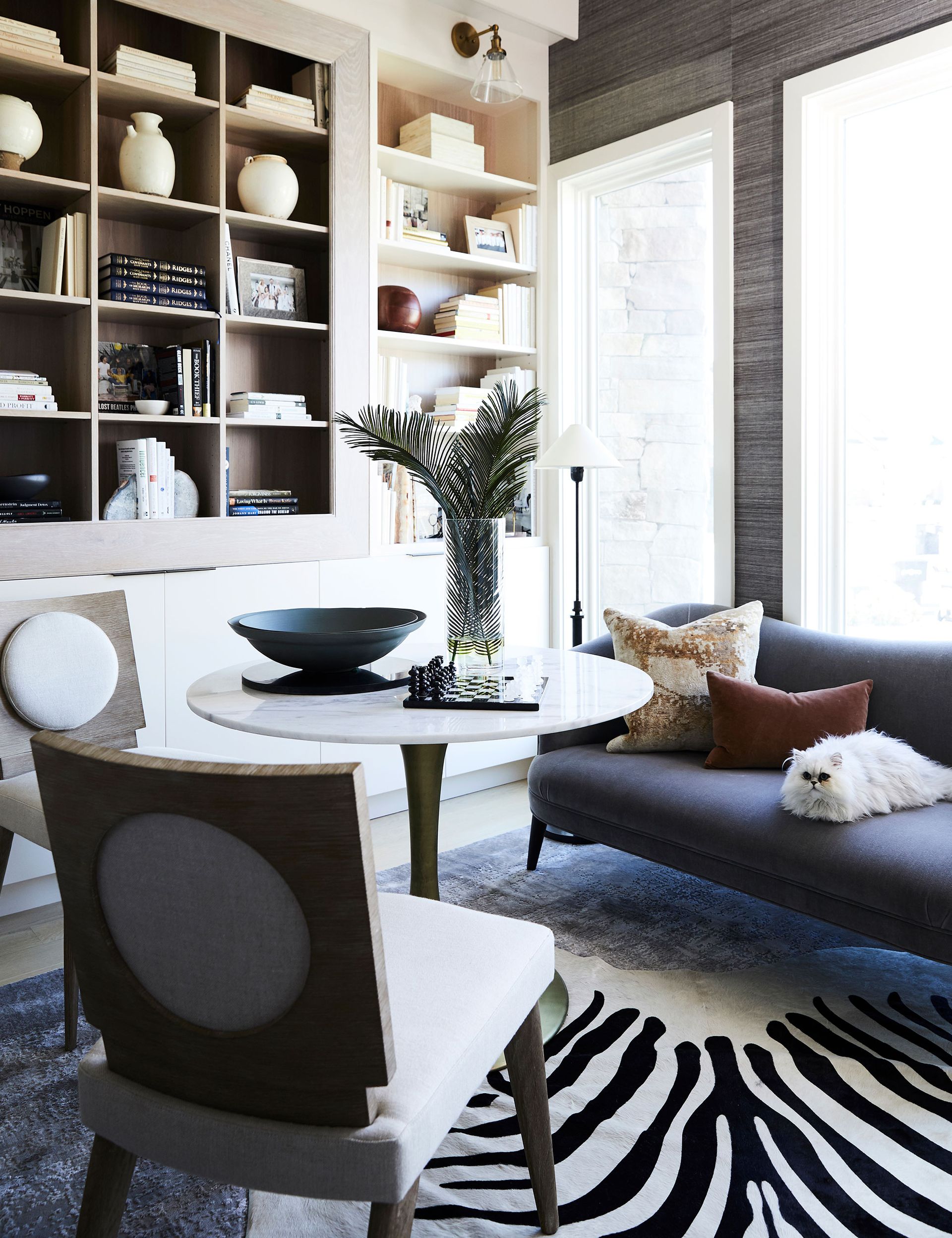
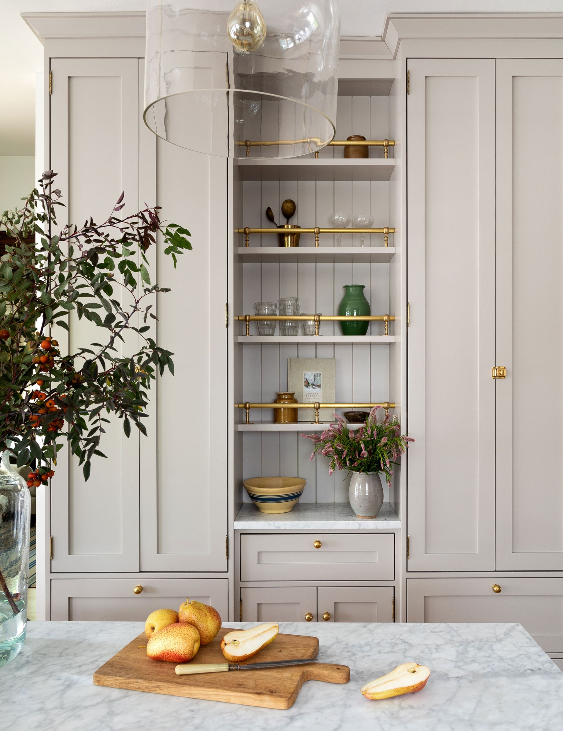
This beautiful wall of bespoke joinery painted in a pale beige hue is hugely characterful and provides plenty of open and closed storage. The finishing touch was the lighting. Without the right lighting, it could end up looking dull and uninteresting, so a blend of wall and overhead lighting was needed to create the right balance of atmosphere and practicality.
‘We used an on-trend cream color scheme for this well-lit dining-cum-living space’ says Jessica Bennett (opens in new tab), founder and principal designer for Alice Lane Interiors. ‘The aim was to create a talking point, transforming it into a place for displaying favorite objects and art.’

Jessica started her creative journey at Utah State University. Her studies there led to her work in an ad agency as an art director but building her home brought back her earliest passion: interior design and trends.
3. Invest in a richly layered look
(Image credit: Waterworks)
Keeping order with your bathroom storage is more than just functionality. This space should be beautiful, too.
‘A good bathroom design should emphasize the unique qualities of the space,’ says interior designer Emma Merry. ‘This often means we commission bespoke furniture to maximize every inch of storage potential.’
Rooms with unusual shapes may make a custom solution the only option, or you may want a design with detailing tailored to suit your scheme. Identify your storage needs, research pictures of styles and obtain quotes from a shortlist of joiners.
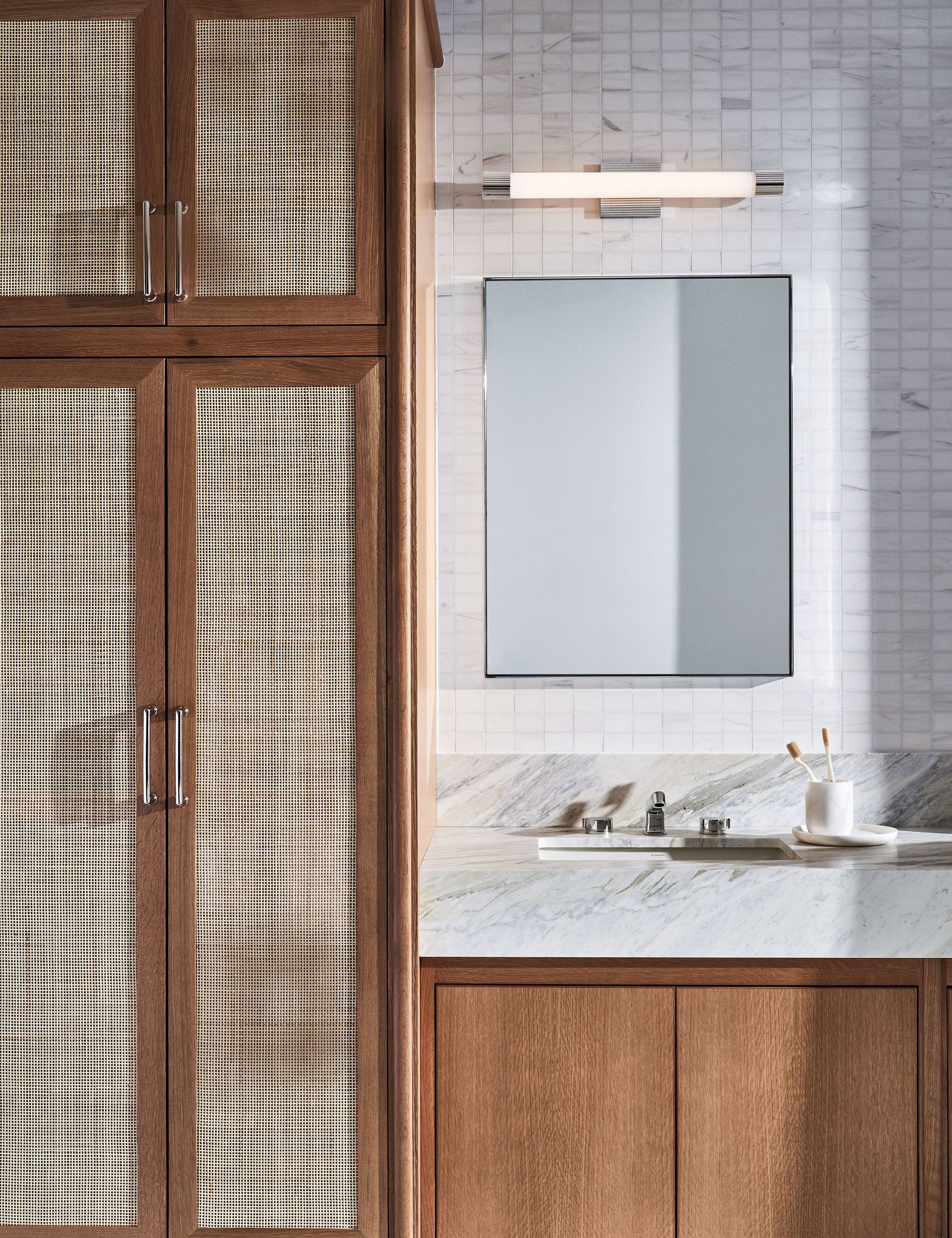
‘It’s the combination of the materials and the layering effect that makes a scheme interesting,’ says Peter Sallick, CEO and creative director, of Waterworks (opens in new tab). ‘In this space, the choice of walnut creates warmth and richness, cane brings texture and lightness, and the cool modernity of marble surfaces and nickel taps adds balance.’ A tall wardrobe allows this bathroom to double as a dressing area, while providing storage for robes and towels, and the vanity cupboards are designed for toiletries.
4. Conceal a TV with bespoke joinery
(Image credit: Studio Ashby)
If you are trying to make a living room look expensive, then you may be wondering how to stylishly hide a TV.
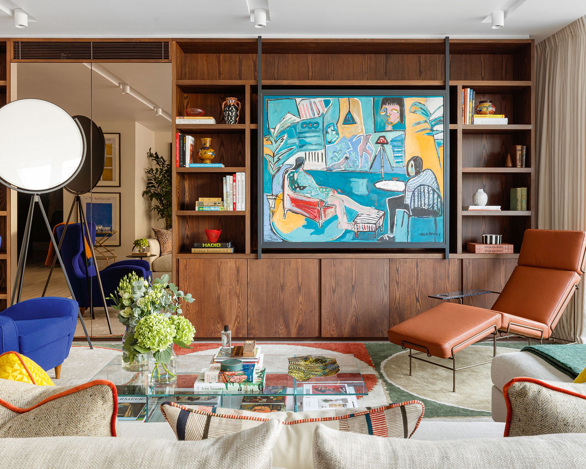
The TV is a ubiquitous presence in sitting rooms but its black reflective screen is regarded as an eyesore by decorators. The most common solution is to house it in a specially designed living room storage cabinet, but it’s not the only one. At first glance, this room looks colorful and bold using Studio Ashby’s signature mix of antiques, bespoke pieces and contemporary design. The surprise is that the art can slide aside revealing the TV behind.
‘The TV must never be on show; that’s one of our rules at Studio Ashby,’ says founder and creative director Sophie Ashby (opens in new tab). ‘In every project, we’ll commission joinery to conceal it like in this project in London’s Mayfair, where we’ve used this beautiful Jack Penny artwork to hide the TV.’

Sophie Ashby is the founder and creative director of Studio Ashby. Having studied interior design at the famous Parsons, The New School in Manhattan, Sophie honed her skills over the years with strong mentorship.
Ashby’s aim is to bring authenticity and thought to each project, not only in the selection of furniture, lighting, and art but in its use of a natural palette of materials and textures.
5. Add shimmering details to your pantry storage
(Image credit: Heidi Caillier / Haris Kenjar Photography)
Picture-perfect and packed with stylish features, there’s more to pantry storage than meets than eye. Unsung heroes of the home, multi-functional pantries play an important role in taking the pressure off the kitchen, but there is no reason why they cannot be both practical and beautiful.
‘Luxury touches and personalized details are gaining ground as clients afford their pantries the same status as their main kitchen,’ says Heidi Caillier (opens in new tab), owner of Heidi Caillier Design. ‘Here, a simple yet timeless color scheme, gold hardware and plenty of marble have the added advantage of keeping bread, cheese, and charcuterie at the perfect ambient temperature.’ A fantastic choice if you want to make a pantry look expensive.

Heidi Caillier Design is a full-service interior design firm, with a project portfolio spanning the US and beyond. Heidi’s design philosophy is based on the belief that homes should be comfortable and livable while at the same time beautiful and curated.
6. Make use of the space under the stairs with a pull-out
(Image credit: Echlin)
For the space savvy, under-stairs ideas are just what you need to ensure one of the most cumbersome parts of the house goes from a fiddly nook to an unexpected feature.
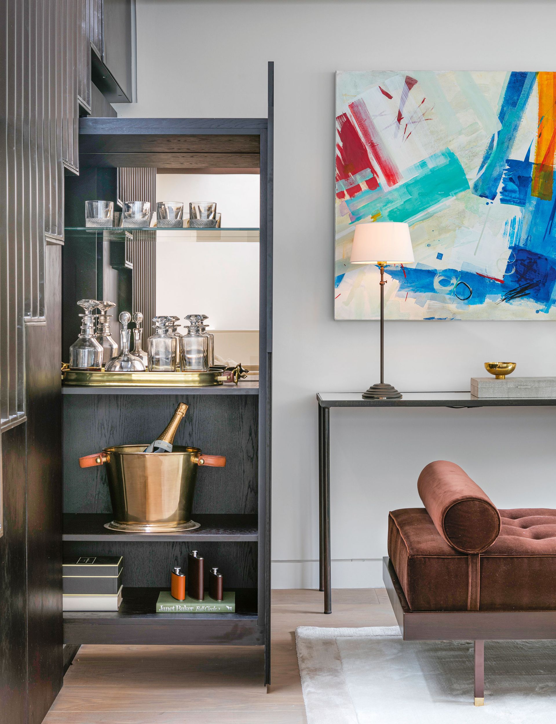
‘Under-stairs cupboards can be a lifesaver, a nightmare, or somewhere between the two,’ says Steve Clinch, head architect at Echlin. Consider how to use the additional depth. ‘Stairs are 31 or 35 in wide – much deeper than kitchen cupboards at 60cm,’ says Steve. The staircase in this project was in the first-floor living area which led to a roof terrace so it made sense to create a pull-out bar.
‘The pull-out nature allowed us to orient the storage in the other direction, giving us a shelf depth of 15in. We then had to balance the weight of the mechanisms, so it didn’t pull out too quickly.’ The rest of the storage was split either side of the bar, one providing access to services, the other a space for outdoor cushions.
7. Go bespoke with a custom vanity
(Image credit: Shalini Misra / Mel Yates Photography)
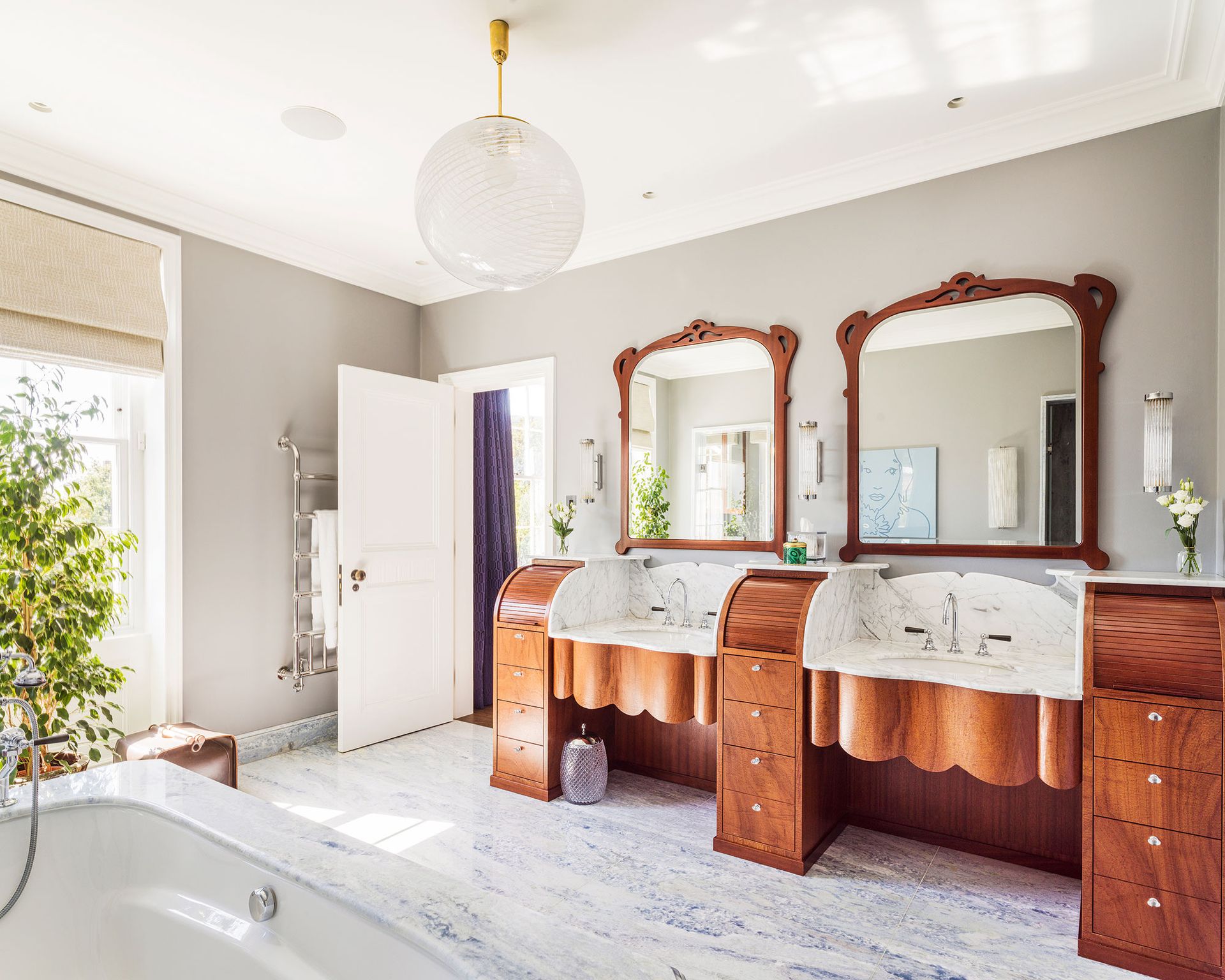
Commissioning a custom-made double vanity is the smart way to achieve your dream piece, says interior designer Shalini Misra (opens in new tab), who based this unusual vanity design on vintage furniture from a French hair salon.
‘The joy of a bespoke vanity is that it can be made to your precise requirements, from dimensions to the amount and type of storage included, making it something that is really unique to you,’ she adds.

Internationally celebrated interior architect, designer and property developer, Shalini Misra, has been creating spaces since she founded her practice over 20 years ago. Shalini qualified architect at the Delhi School of Architecture and Planning (SPA) in India, and specialized in Urban Planning at the University of Columbia in New York, before studying Virtual Reality in Architecture at the Bartlett School of Architecture in London.
FAQs
Should I invest in bespoke cabinetry?
Yes, bespoke cabinetry is a worthwhile investment.
‘Built-in cabinetry is not only an investment and will hopefully add value to your property but is also personal to you as you will be living with it every day,’ says cabinetmaker Ed Keyser. Although more expensive than shelving, drawers, visible or behind doors, are a much more efficient way of storing and accessing items. If drawers are not possible, then sourcing (during the design stage) boxes or baskets which fit into the cabinetry is a good option, especially for deep or hard-to-access spaces.
A final expert tip is to use any existing architecture to make a house look expensive. If there is a nook or a niche in a room, use it. ‘Make awkward corners a point of interest,’ says Camilla Clarke of Albion Nord.
‘Don’t be afraid to use unusual furniture pieces: a bookshelf doesn’t have to be a bookshelf, you can stack books on a bar cart, on the fireplace mantel, or on a windowsill. Be sure to light the shelving or book storage area, too, as this will ensure it becomes something of a decorative focal point for the eyes.

