Amy Pitzel used one word to describe the old living room and dining room in her family’s Katy home: sad.
They had drab finishes and furniture, but until recently, she never felt it was the right time to do something about it.
When she retired from her job as a government teacher and cross country/track head coach at Katy Tompkins High School last May, though, Amy decided it was time to focus on her family’s house. It helped that her 13-year-old daughter encouraged her all along the way, gathering ideas on Pinterest and Instagram.
A MODERN UPDATE: Bellaire home near Texas Medical Center gets stunning modern makeover
It was Amy’s daughter who found interior designer Veronica Solomon of Casa Vilora Interiors, and when Pitzel looked at her portfolio online, she liked what she saw.
The San Antonio native was interested in classic style with quirky touches and plenty of color. And she wanted a completely new look.
Amy, now 46, moved to Houston years ago when the company she worked for transferred her. Jason Pitzel, now 51, worked for the same company, but in Minnesota. After he, too, was transferred to Houston, the couple met, and they’ve been married 20 years. The couple also has a teenage son.
Solomon approached each room — the living, dining, foyer, powder bath and a guest room turned into a home office for Amy — with layers of ideas.
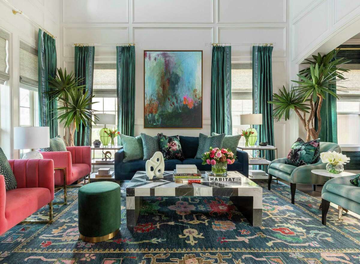
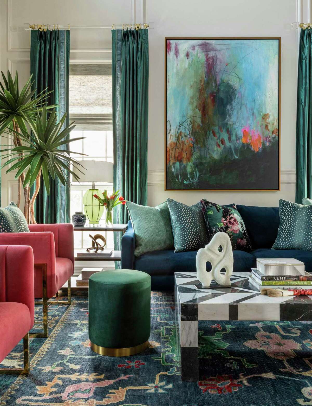
Millwork creates an architectural feature that runs up the walls of the living room, a space now saturated with color.
Claudia Casbarian/Julie Soefer PhotographyFor starters, the home’s 12-inch floor tiles were replaced with hardwood flooring, instantly elevating the entire house.
The living room was a sizable vertical space, so Solomon gave the Pitzels and their guests something to draw their eyes up. She added trim work for a paneled effect and a chandelier worthy of the attention it now gets.
A NEW CHAPTER: Houston woman finds efficiency in River Oaks apartment with a view
“The front living room was this volume with tall ceilings, and everything in it felt so dwarfed and so lacking. It was such a missed opportunity,” Solomon said. “She said she loved color and wanted to do something different. I knew the new flooring would set it off, so I had to find a way to bring the room into scale, and the millwork feels more architecturally relevant.”
On the ground, Solomon added a rug with a deep blue background and plenty of accent colors, with deep blue draperies hung high on contemporary acrylic rods.
This is a carousel. Use Next and Previous buttons to navigate
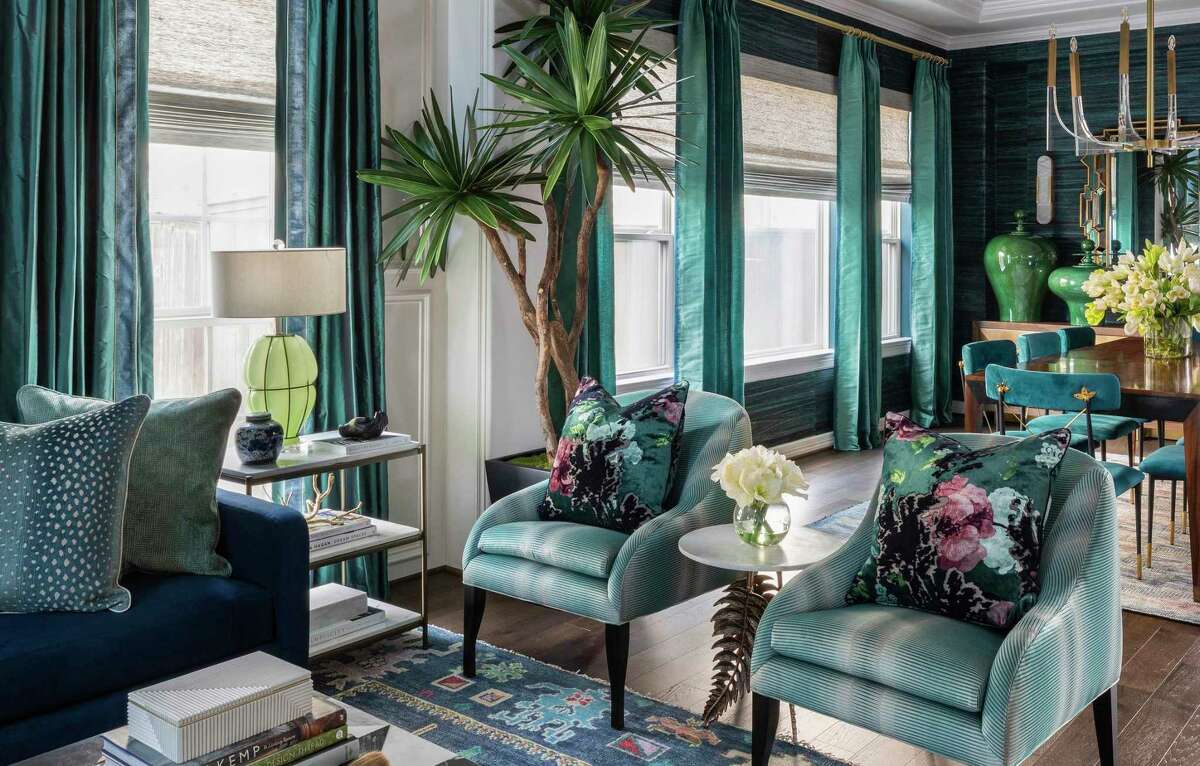
A dark blue sofa and two pairs of chairs, one in pink and one in muted green, finish the seating.
Between plants, lamps, pillows and objets d’art, the living room is a lesson in how layers of accessories can finish a room. Solomon brought in a pair of faux trees and faux flowers in vases, too.
“I always bring in trees — at every opportunity. They’re heavy with texture and add height and life in the room,” she said. “Little florals help to bring colors together and bring in nature, even when they’re faux flowers.”
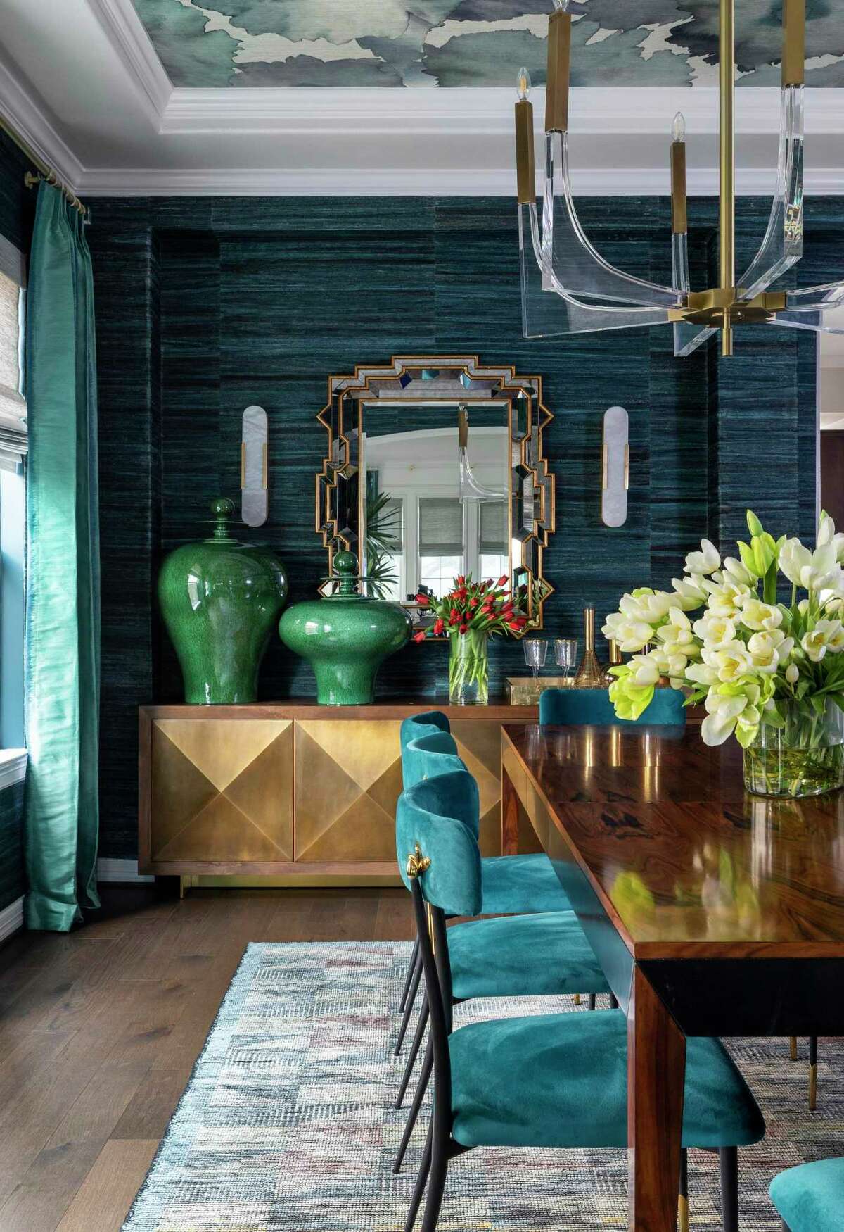
In the dining room, the walls do the talking.
Solomon chose teal Thibaut grasscloth made with bark from banana trees for the walls, paired with an oversized floral in shades of blue by Phillip Jeffries for the ceiling, leaving the tray ceiling’s trim a bright white.
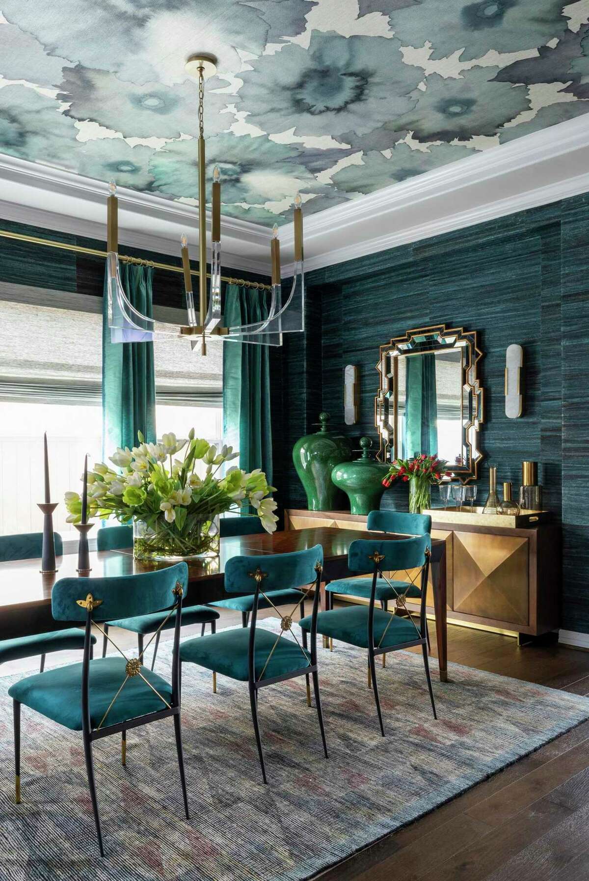
Teal wallcoverings and upholstery factor heavily into the formal living room and dining room.
Claudia Casbarian/Julie Soefer Photography“I could put grasscloth in every single room. What I love most is the natural look of it — the seams don’t line up, and you can see the panels. Some people hate that, but I absolutely love it because it adds depth,” Solomon said.
They added a long buffet with a mirror, vases and a tray of barware, too. The acrylic and brass chandelier over the dining table is more understated, letting the wallcoverings and other things in the room shine.
WHEN THE TIME IS RIGHT: 1950s-era Spring Branch ranch home gets a major update
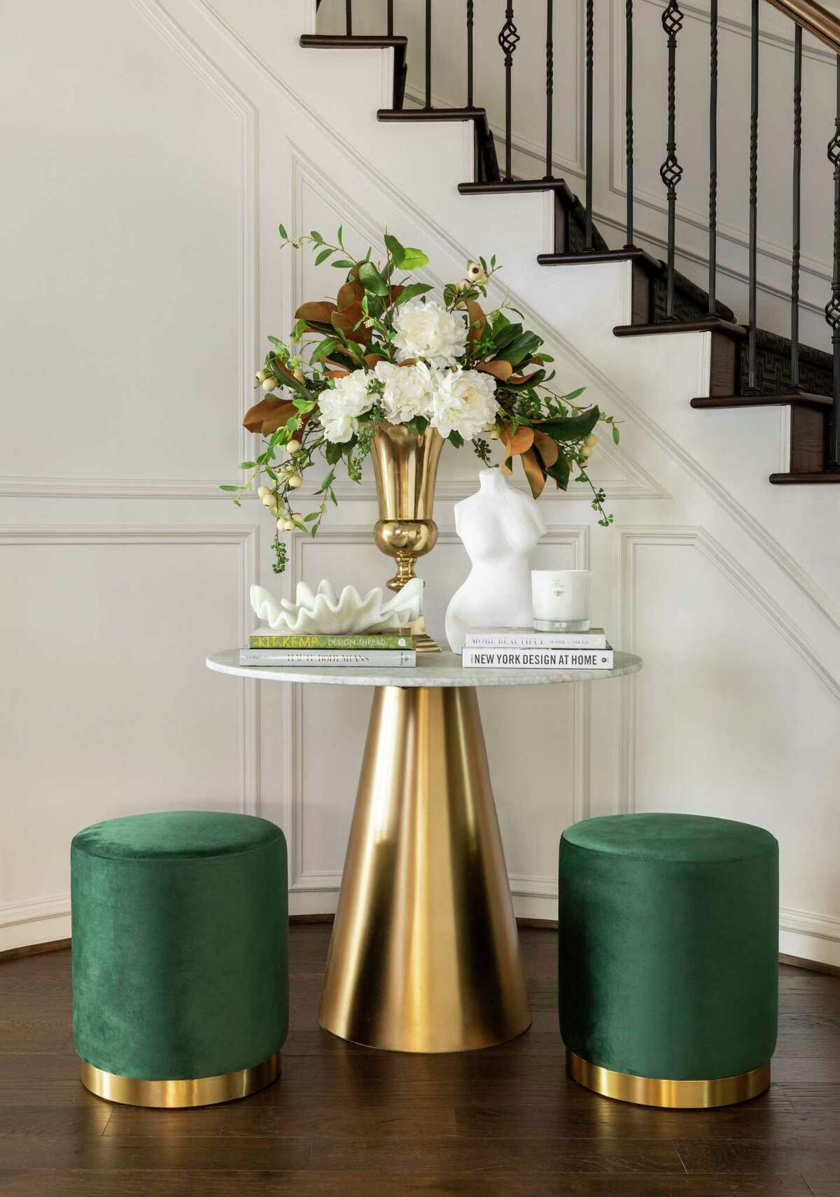
In the foyer, a curved wall for the stairs got millwork of its own to continue the architectural treatment in the nearby living room. A small round table with a cone-shaped base and a pair of velvet stools make the spot a chic place to pause.
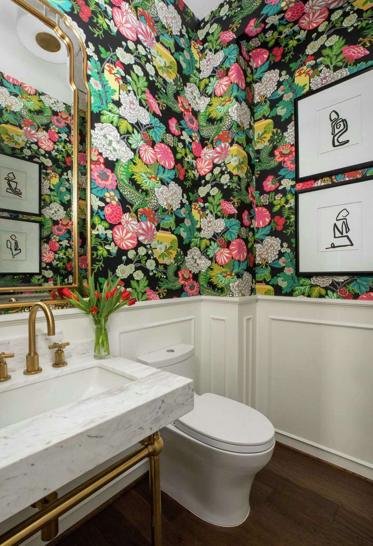
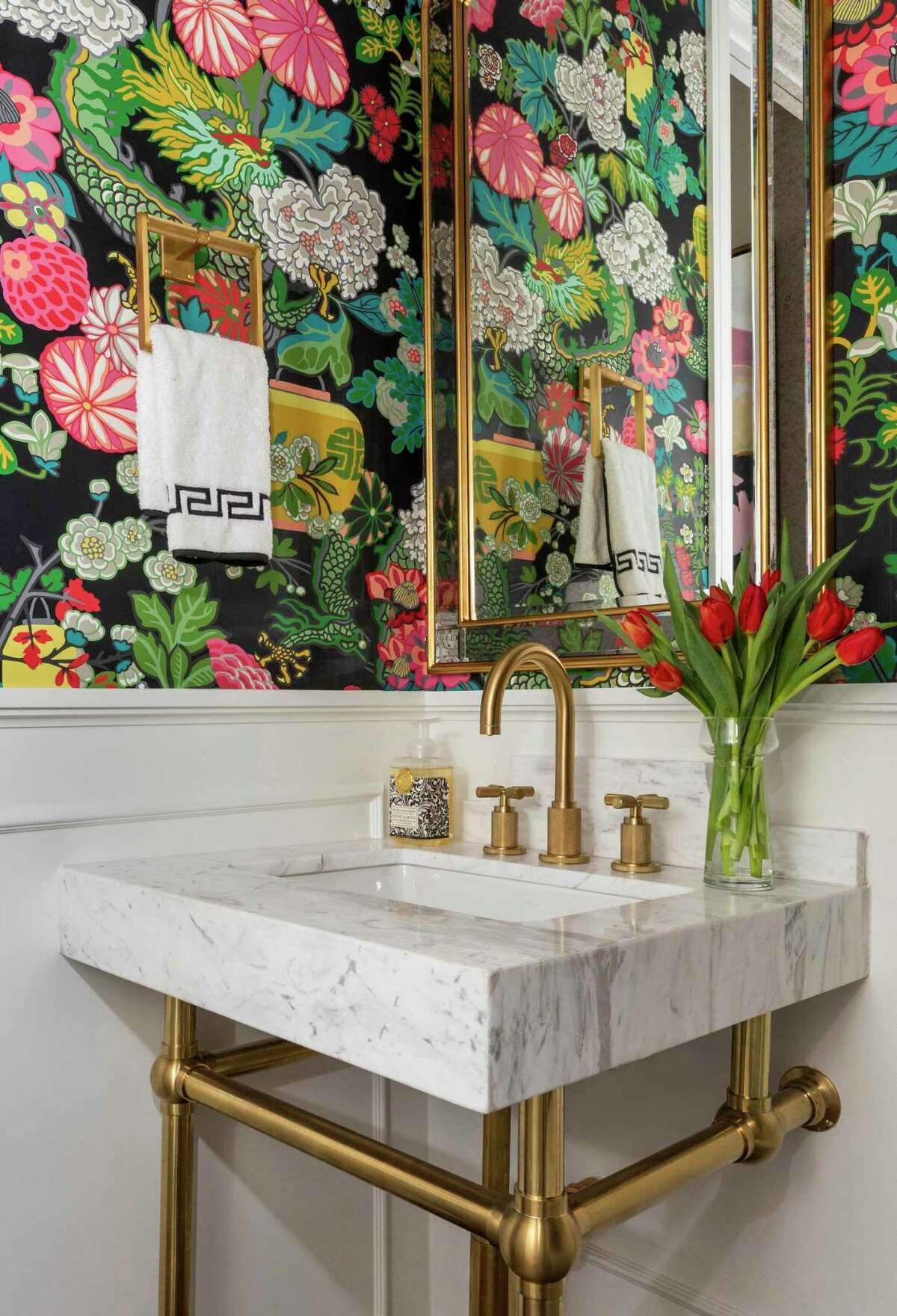
Colorful wallpaper in an Asian print provide the energy behind the dramatic makeover in the powder bathroom. The room got a custom-made sink on a brass base, installed with brass plumbing fixtures and a framed gold mirror.
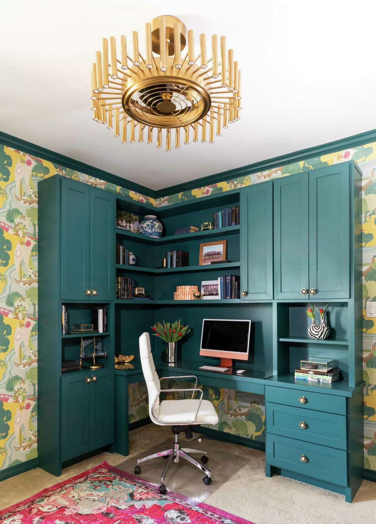
The blue-green-pink palette continues in Amy’s home office, where a teal desk looks handsome against bright chinoiserie wallpaper.
Claudia Casbarian/Julie Soefer Photography“I have always loved that motif. You’ll see it in a jar or something” Solomon said of the wallpaper in the powder bathroom and another print in Amy’s new home office. “I love to see how it’s taken off. It’s such a traditional classical element that will always be relevant, so I bring it in when I can because I personally love it.”
An upstairs guest room became Amy’s new office, but it satisfies the desire of Jason, who works in software sales, to have a guest room for visitors.
FOR THE POOL LOVERS: Houston homeowners are making money off the ‘Airbnb for swimming pools’
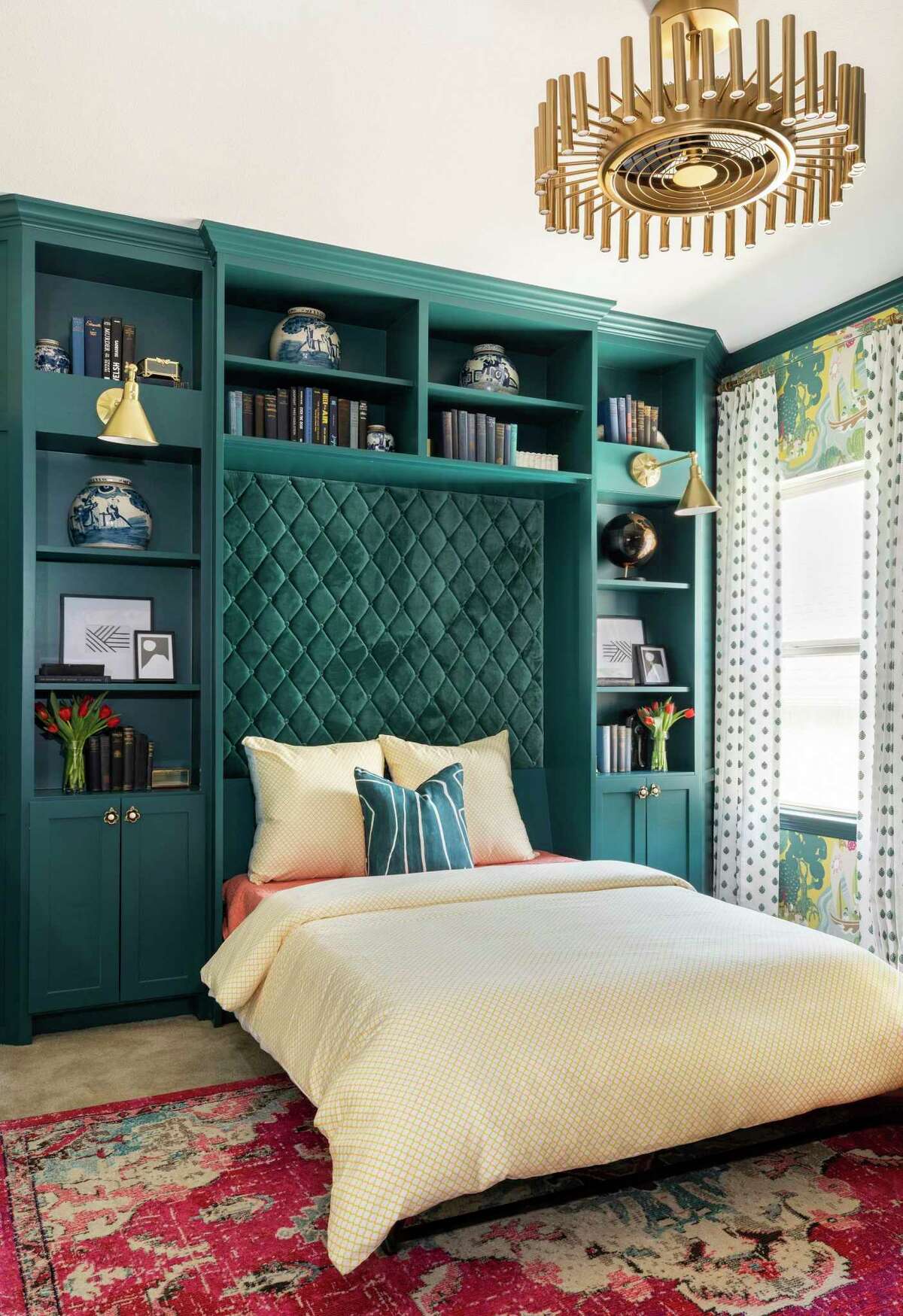
The compromise was to install a Murphy bed that, closed, simply looks like a wall panel with pretty art and well-decorated shelving around it. Across the room, a built-in desk with cabinets and shelving provides Amy with a place to get things done.
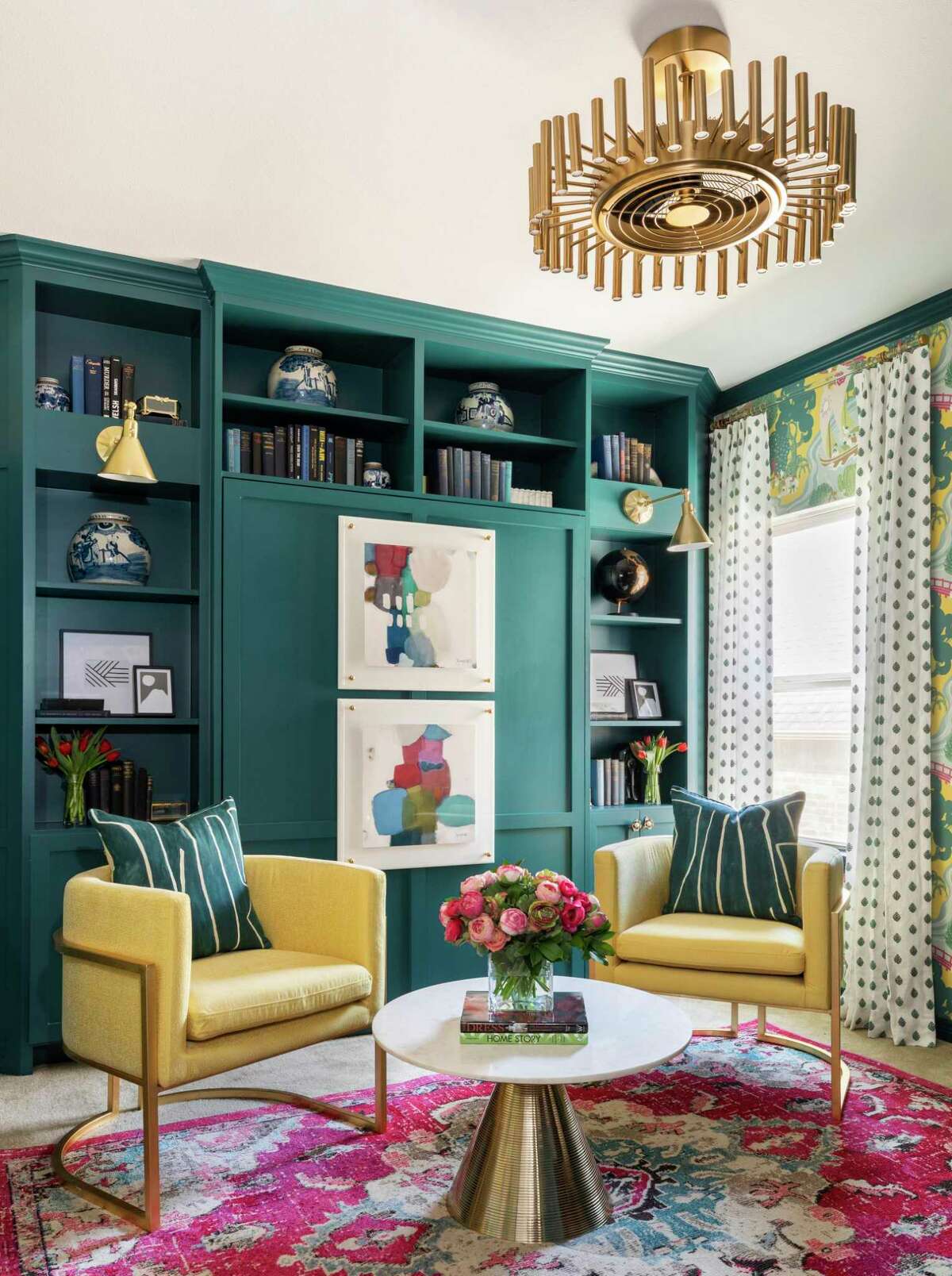
All of that brings function to the room, and the beauty comes in cabinets painted Benjamin Moore’s “Oasis Blue” — another shade of teal — set against colorful chinoiserie wallpaper on a sunny yellow background, with a pair of contemporary chairs upholstered in yellow. A rug in the center of the room shows the colors — pinks, blues and greens — you find elsewhere in the room.
Topping it all off is what ought to be the “it” light fixture of the year — a “fandolier.” In the center it’s a ceiling fan, but the plain inner-workings of it are obscured by the light fixture that surrounds it.
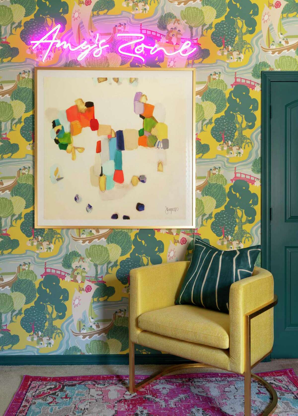
This vignette shows the full palette in the home office: teal, yellow and pink.
Claudia Casbarian/Julie Soefer PhotographyWith all of these updates installed, Solomon encouraged the Pitzels to update their family room, since old parts of a house can look even more worn and dated compared to the new things.
They got rid of the old brown sofa and brought in a comfortable sectional, new coffee table and a rug.
The bright new colors all make Amy happy.
“I didn’t think this would ever be my style, but I love it. I love the color and pattern,” Amy said. “I knew I wanted wallpaper in the bathroom, but I never would have thought of putting wallpaper on the dining room ceiling. But it’s stunning.”

